Quizlet
/
Sumo was a gaming tournament platform built by Metafy to compete with established players like smash.gg and Battlefy. Metafy wanted to build something around the actual people running and competing in community tournaments, with better tools for players, viewers, and tournament organizers alike.
The project ended early when the market shifted in 2022, before a shippable product was ever finished. I've continued the visual direction development and on my own because the product thinking is deep and I love this platform idea and style (plus AI tools make it all easier).
MY ROLE
I was one of the product designers on this project at ustwo. In the branding phase, I partnered with our brand designer, exploring creative territories together. From there I worked with our design lead to translate that branding into initial product style directions.
Once production began, I worked alongside a senior designer and our PM to define job stories and sprint goals. I co-owned the browse experience and the bracket redesign, and later worked with our design lead to componentize the team's work into a final deliverable.
BRANDING
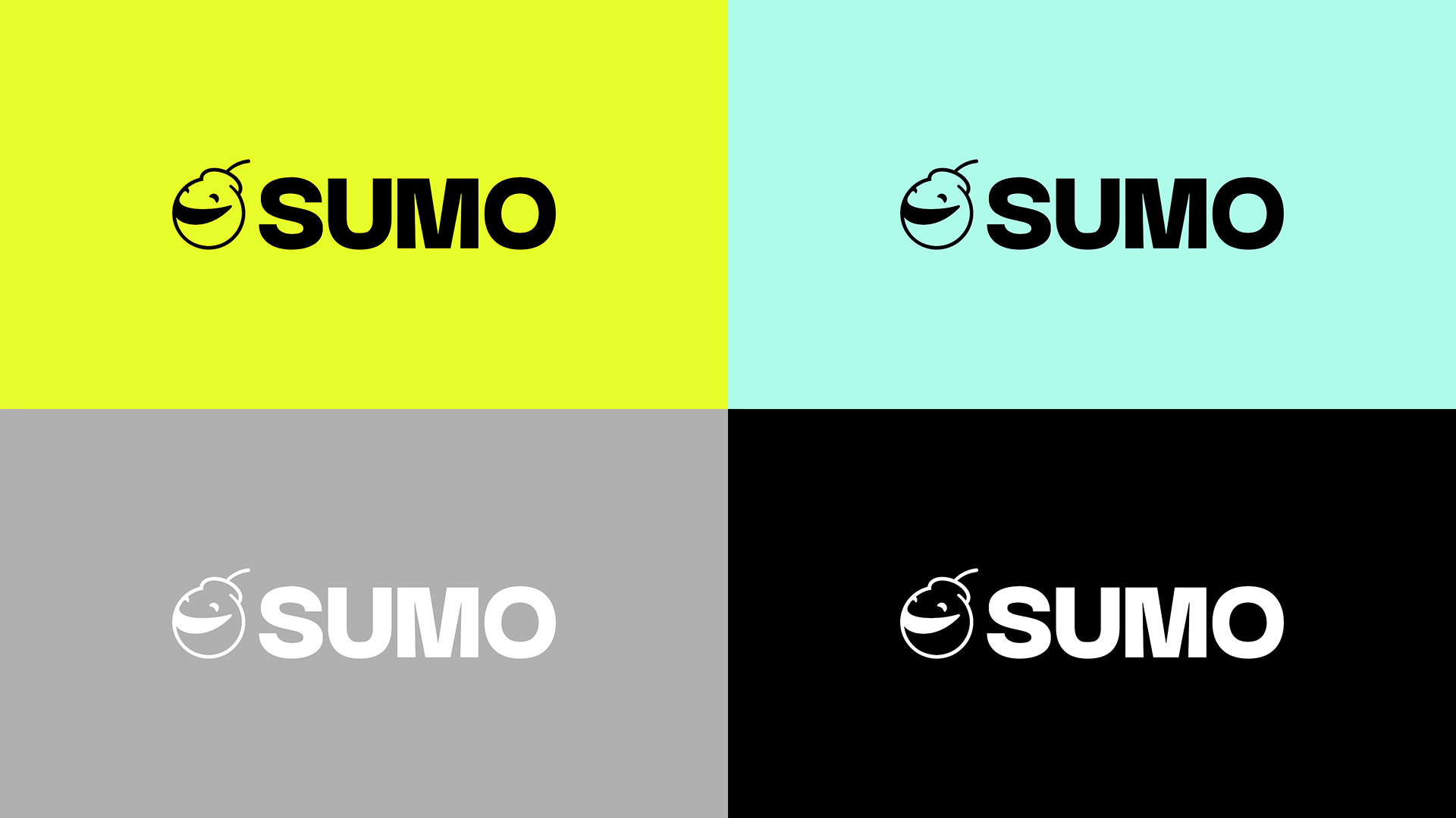
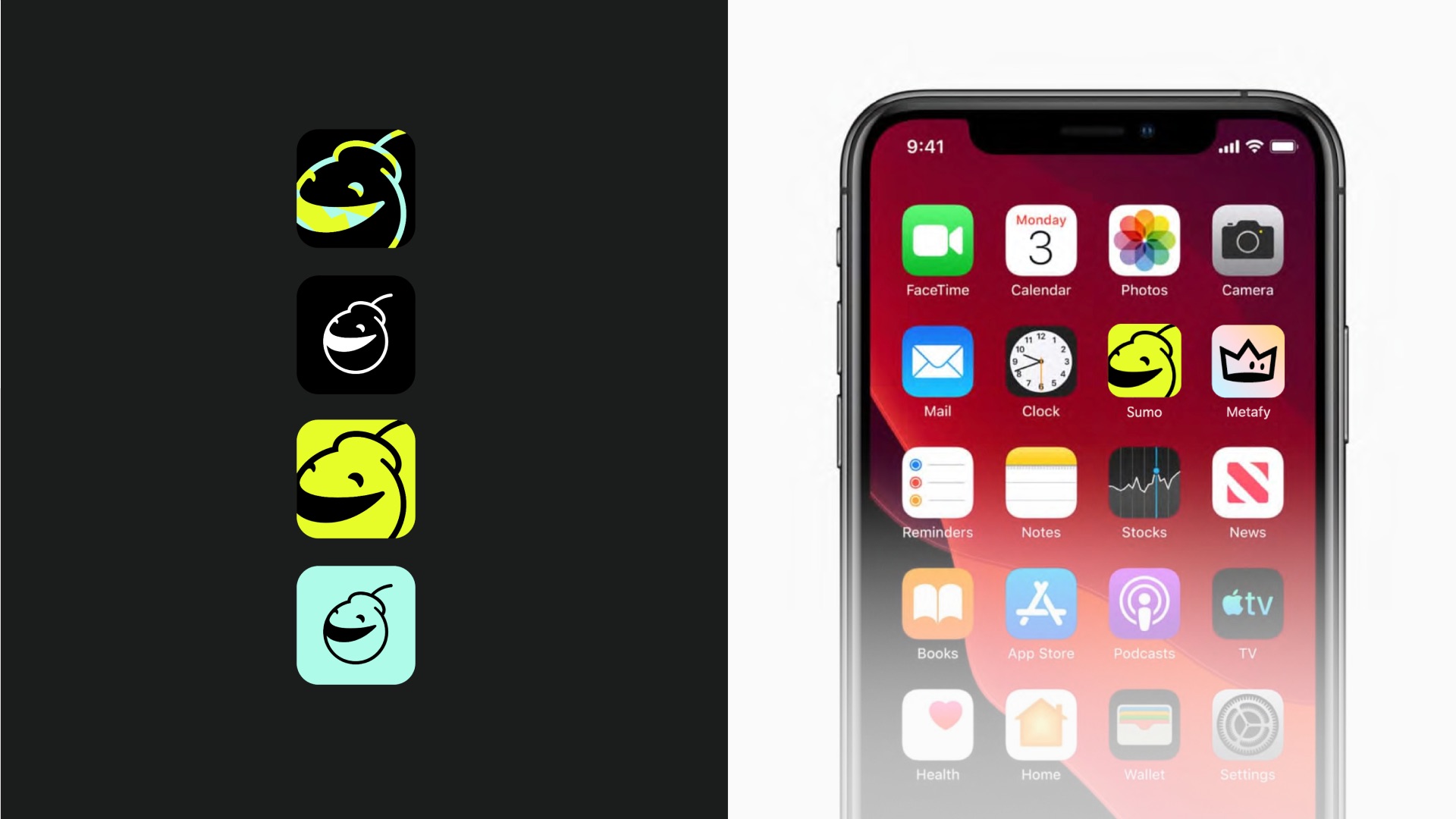
Sumo's name comes from "sumau," meaning to compete or fight. The brand needed to hold two things at once: the discipline and tradition of sumo, and the loud, chaotic energy of competitive gaming culture. The smiling bomb logo captures that fusion directly, a symbol of competition with a wink of danger, designed as a sibling mark to Metafy's own brand.
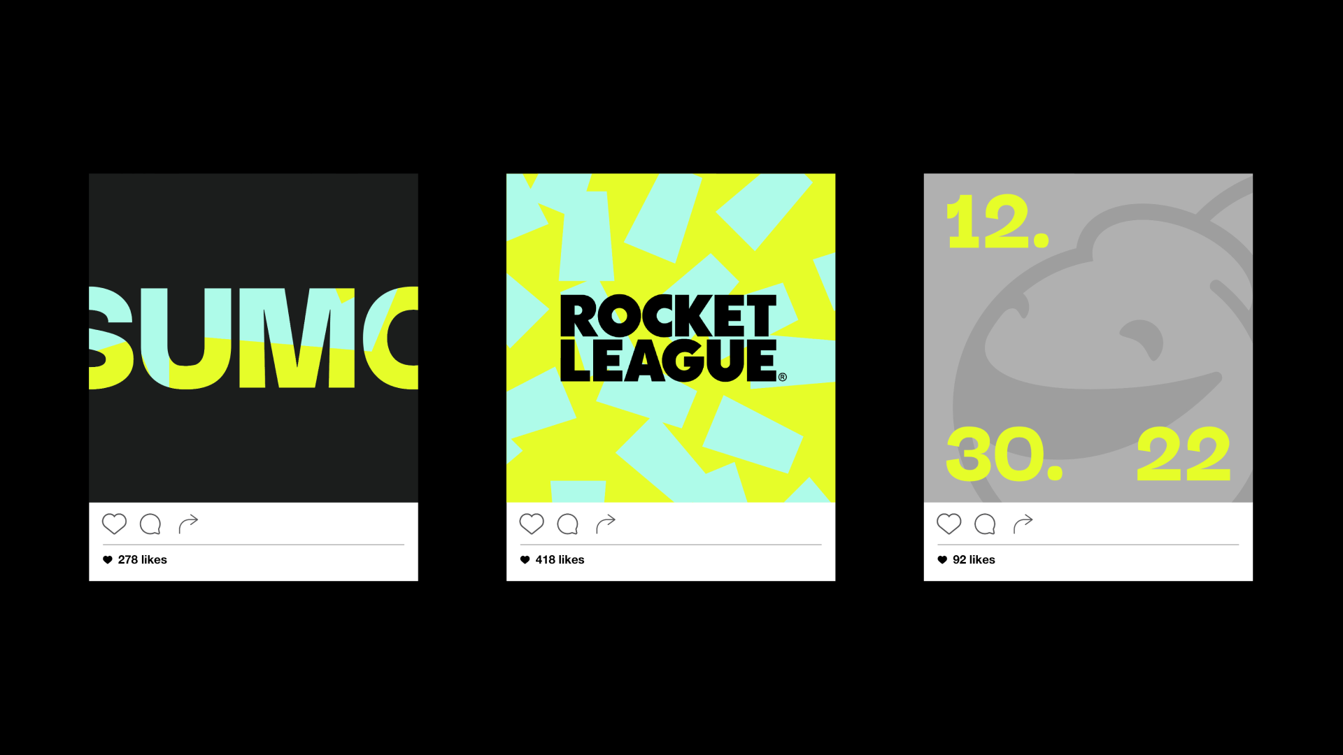
The confetti pattern that came out of this phase does double duty, reading as a burst of celebration while also referencing shide, the paper shapes used in Japanese festivals and rituals. Our brand designer led the logo work, and I partnered with him on exploring the broader territory the brand could live in before it was handed off to translate into product.
RESEARCH
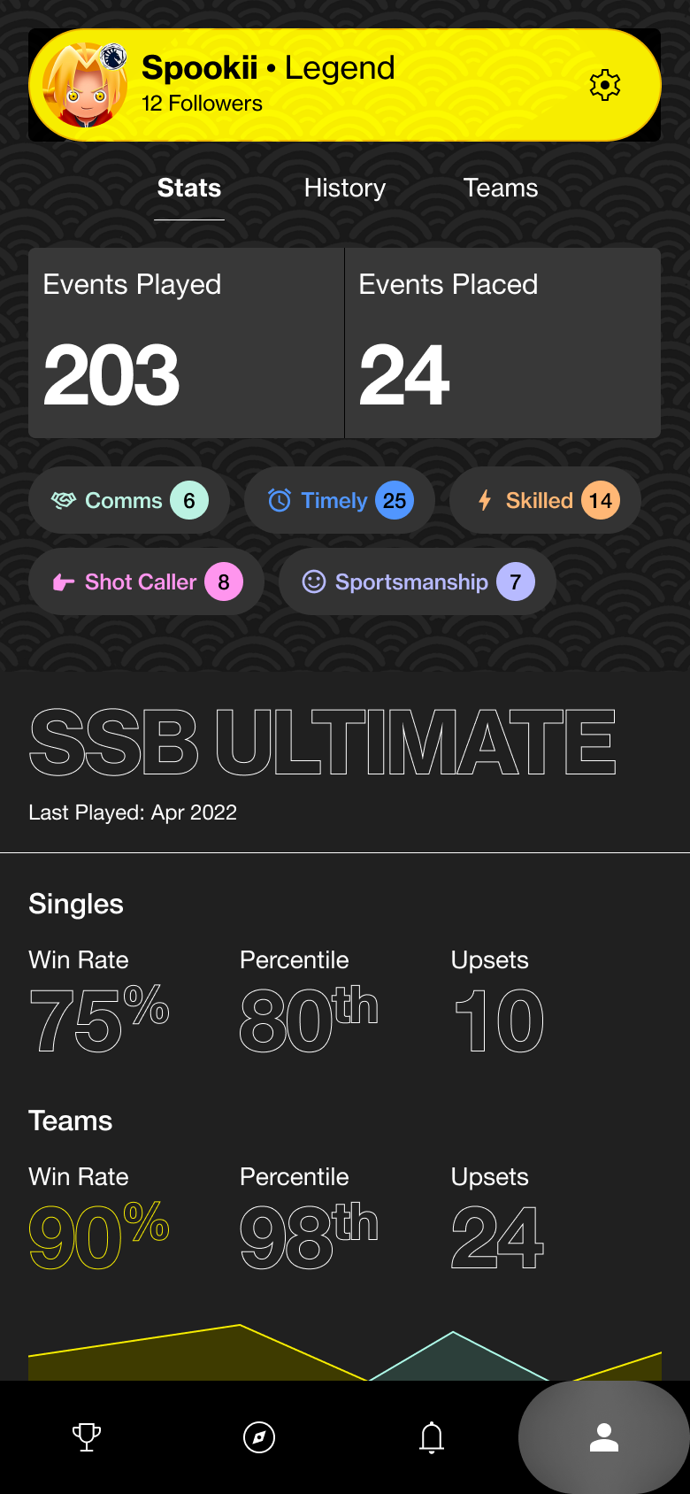
Every match on Sumo involves three groups with different needs. Players compete and need to log outcomes. Tournament organizers manage many matches simultaneously and step in when disputes arise. Viewers want to follow along, live or after the fact. Tournament organizer needs were mapped early through journey work, but the focus of the design effort was the viewer experience as the foundation of the product, with player experience as its real differentiator.
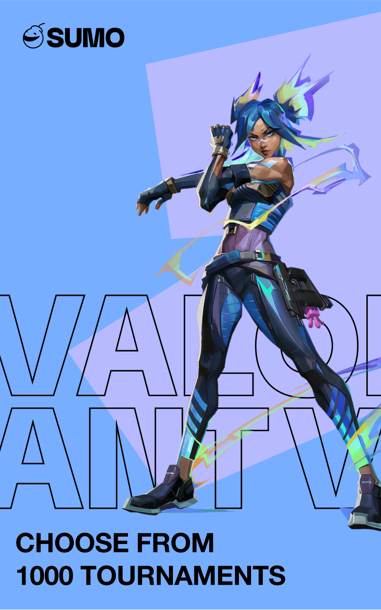
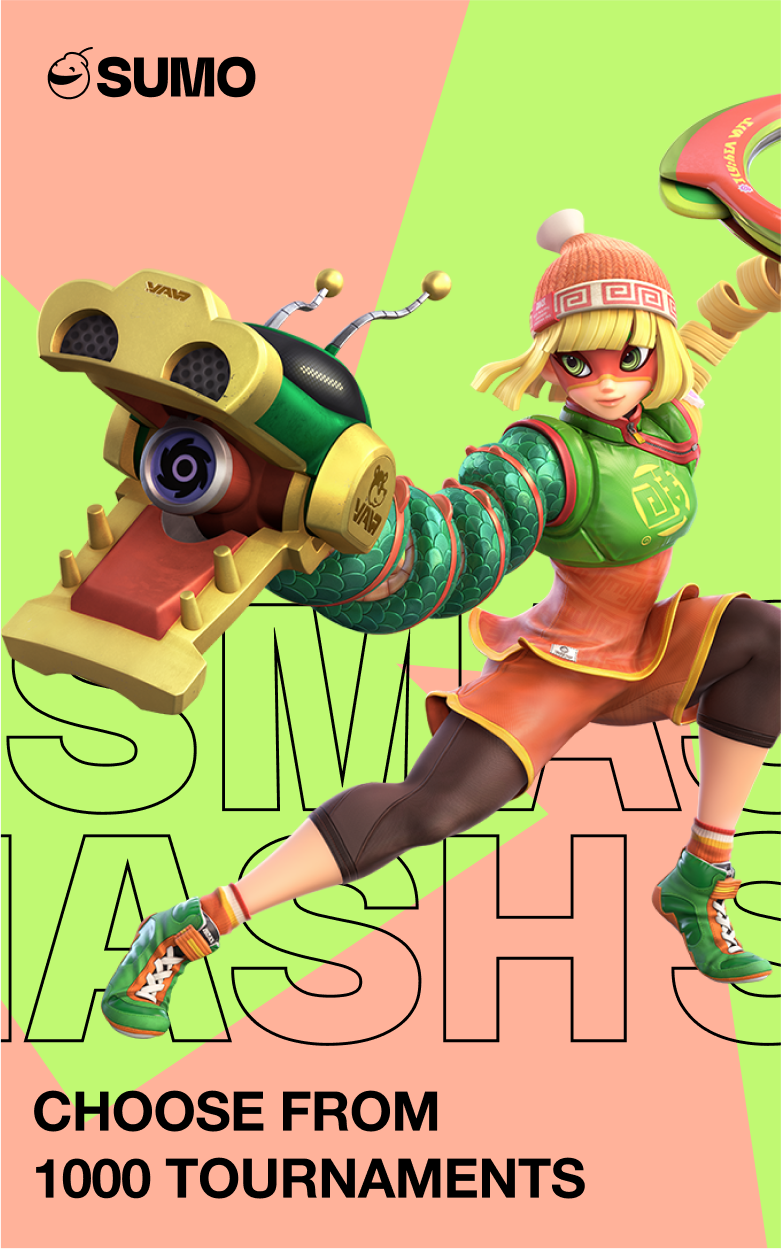
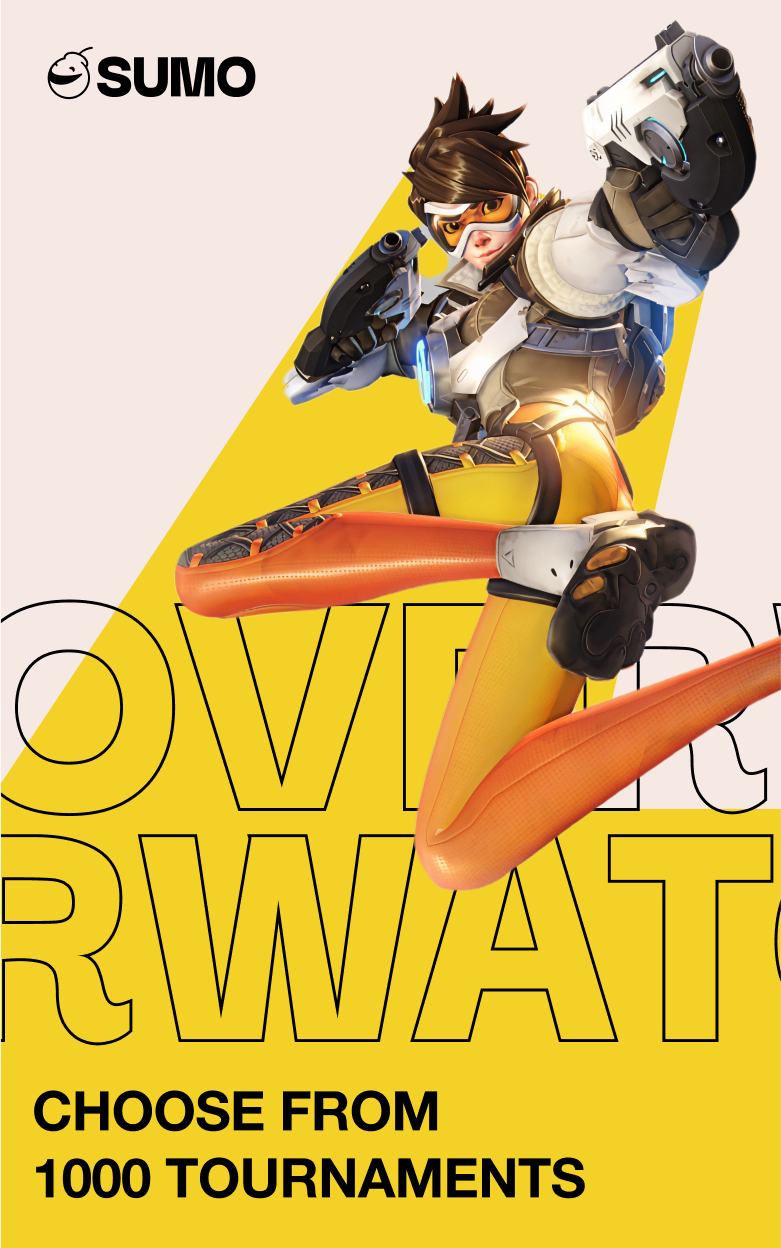
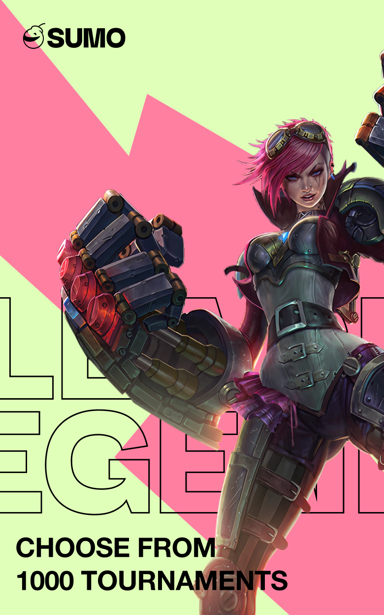
Smash.gg and Battlefy had no real way to follow a tournament as a whole. Someone watching a stream on Twitch had no way to understand how the player or team they cared about was actually doing across the rest of the event, their standing, their stats, or their path through the bracket.
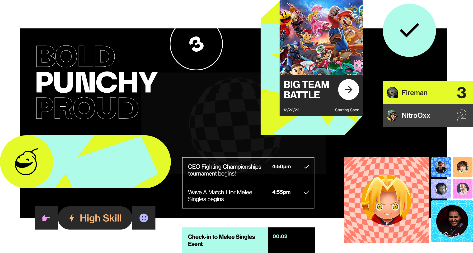
For players, the deeper problem was trust. Match outcomes were self-reported, which left room for disputes and bad actors, and put pressure on tournament organizers to referee conflicts that a better system could have prevented in the first place. The opportunity was to make the platform itself the source of truth for a match.
APPROACH
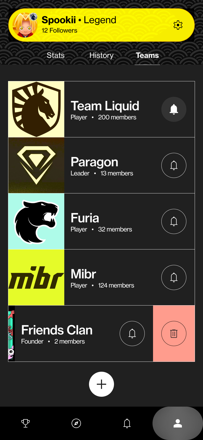
The browsing experience became the backbone of the product. Every user, regardless of role, needed a clear way to move from the scale of an entire tournament down to the specific match or player they cared about. I co-owned this structure, focusing on navigation that respected how a fan actually thinks about following a scene, by player, team, or event.
The bracket became the feature I spent the most time on, and the one I'm most proud of. Traditional bracket UI fails in one of two ways. It either shows the entire bracket at once, which is unusable on mobile without constant zooming, or it collapses into a flat list that loses the structure entirely.
I redesigned the bracket to represent that nested nature of tournament rounds, pools, and waves, and making it simple to move between levels of the hierarchy. The result served every user type in the same view, a player finding their next match, a viewer tracking where their favorite competitor stood, and even the beginnings of a manageable view for organizers overseeing a large event.
CONTINUING ON
The engagement with Metafy ended abruptly in 2022. The UX and structural thinking were tight, but it were never finished visually before the project was cut short. I've since gone back and completed that visual resolution on my own, applying the brand direction fully across the experience. The next step is building it out in Xcode and Cursor, to finally bring this work to life.
CREDITS
CARISSA VELEZ
DELIVERY
AMANDA BRANDL
DESIGN
JOE HODAPP
DESIGN
LANDRY MILLER
BRANDING